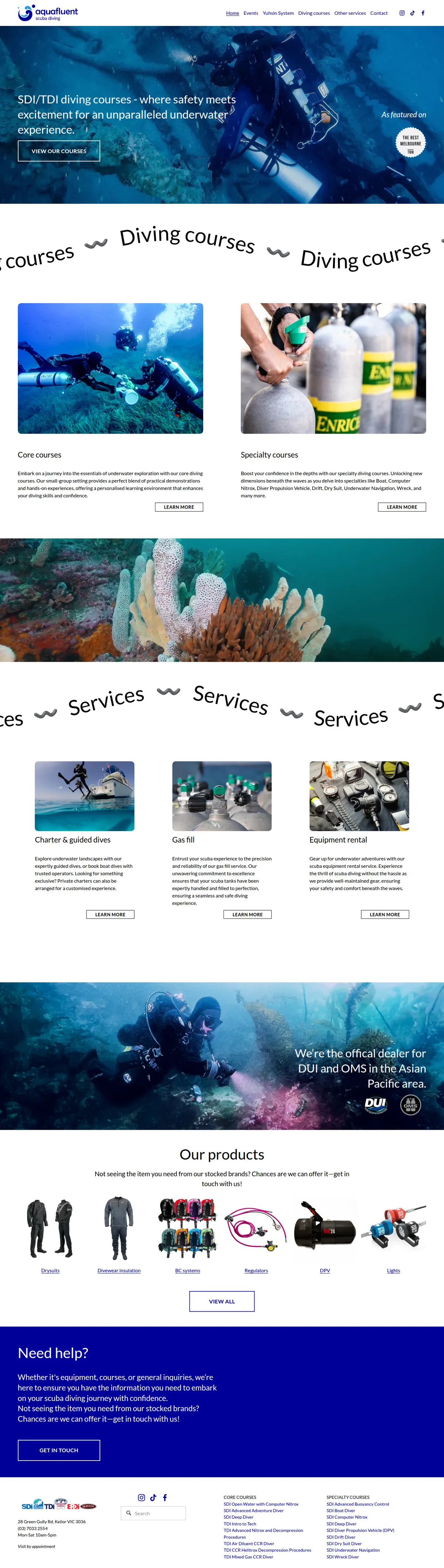
Hover to preview · Drag or scroll inside either frame. Use arrow keys when focused.
BeforeTheir designWebsite captureAfterOur redesignExplore the complete design Their design beside our redesign. Our redesign has not been deployed. Design captures from 2026-09-27.
What the transformation changes
A clearer reason to choose.
A simpler way to enquire.
01
Explain the learning experience before the catalogue.
Their design. Course and service categories follow a general diving introduction and repeated section banners.
Our redesign. Small-group coaching, individual attention and training progression are given a dedicated introduction before the service choices.
A learner gets more context for choosing an instructor, not just a course name.
02
Bring the next steps together.
Their design. Visitors follow separate links to explore courses, charters, equipment and other services.
Our redesign. Course and service cards lead into a booking sequence, practical questions and contact details.
The design gives the breadth of the offer a clearer route towards a specific enquiry.
This is a design and content assessment of the two versions, not a claim of measured increases in enquiries, search rankings or loading speed.
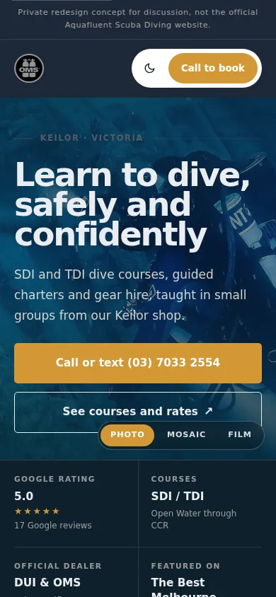 Designed for a smaller screen, too.Next projectA neighbourhood restaurant in Penang↗︎