Hover to preview · Drag or scroll inside either frame. Use arrow keys when focused.
BeforeTheir designWebsite captureAfterOur redesignExplore the complete design Their design beside our redesign. Our redesign has not been deployed. Design captures from 2026-09-27.
What the transformation changes
A clearer reason to choose.
A simpler way to enquire.
01
Give a broad diving offer a clear structure.
Their design. Courses and programmes appear as a long succession of image-and-text blocks before further travel and conservation information.
Our redesign. A local diving introduction leads into a more compact course and experience grid, then equipment, guidance and conservation sections.
Different experience levels have clearer routes through the same business.
02
Build confidence before the first question.
Their design. The source already provides course descriptions and booking links, but the visitor has to work through a lengthy page.
Our redesign. Local-water imagery, guide and equipment explanations, FAQs and a final contact invitation bring preparation and reassurance together.
Someone new to diving can understand the support around the activity as well as the activity itself.
This is a design and content assessment of the two versions, not a claim of measured increases in enquiries, search rankings or loading speed.
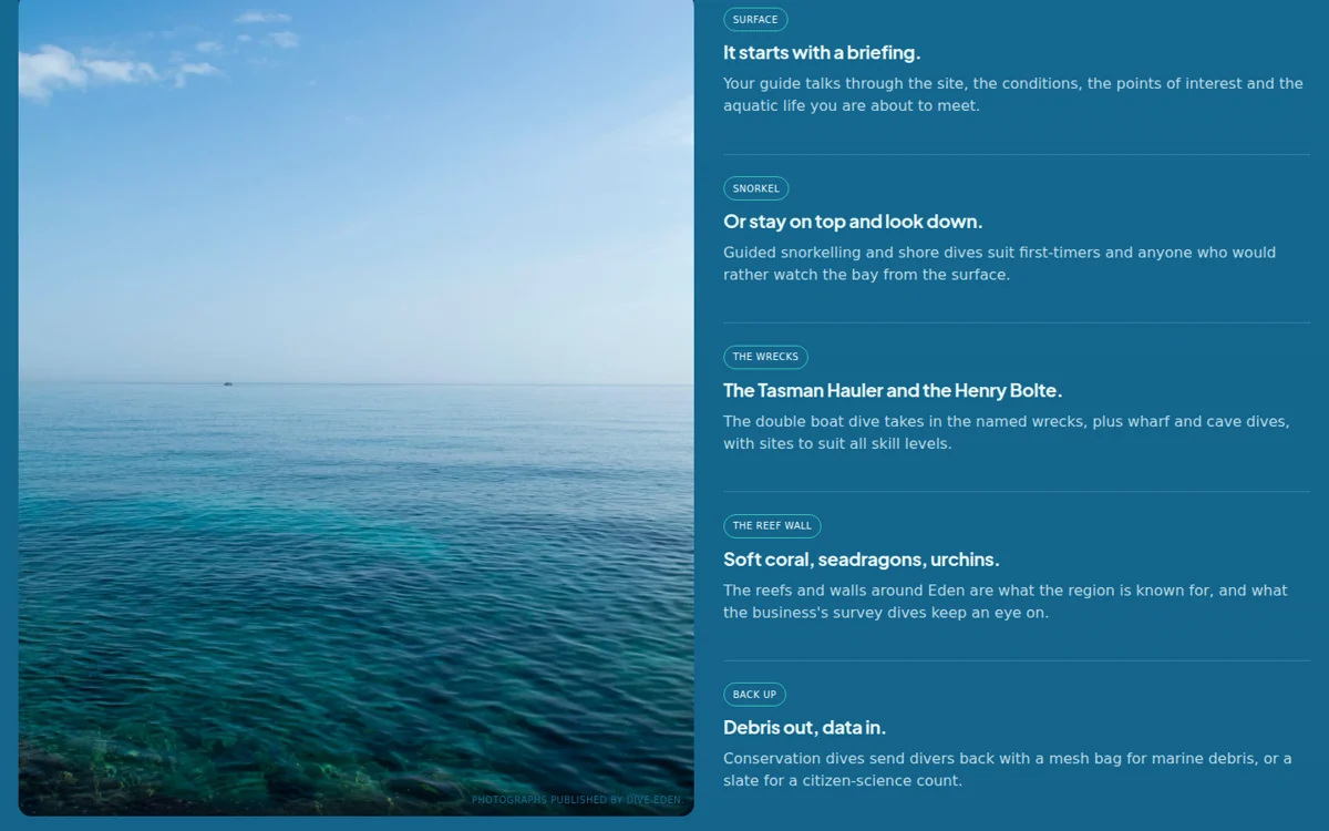 A dive school in Eden content and interface detail
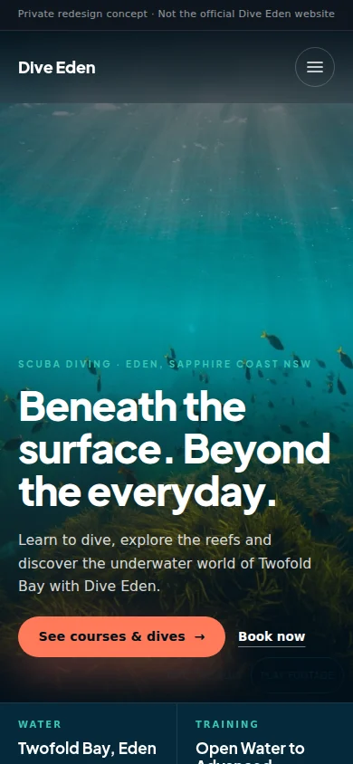 Designed for a smaller screen, too.Next projectA neighbourhood restaurant in Penang↗︎
