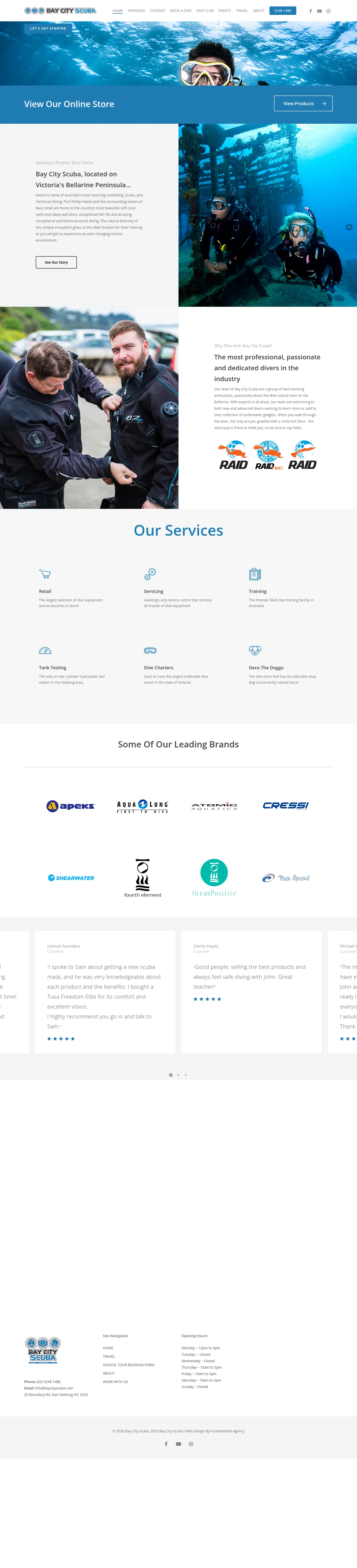
Hover to preview · Drag or scroll inside either frame. Use arrow keys when focused.
BeforeTheir designWebsite captureAfterOur redesignExplore the complete design Their design beside our redesign. Our redesign has not been deployed. Design captures from 2026-09-27.
What the transformation changes
A clearer reason to choose.
A simpler way to enquire.
01
Separate the reasons someone visits.
Their design. Store promotion, the centre’s story, services and brands share a general homepage flow.
Our redesign. Distinct service cards distinguish buying and servicing equipment from learning and diving, followed by named training options.
A visitor can identify the part of the centre that matches their immediate need.
02
Make expertise easier to recognise.
Their design. Team information and customer reviews are present, but sit within similar white sections.
Our redesign. A stronger type hierarchy and contrasting sections separate the team, customer feedback, shop questions and visit details.
Useful reassurance is easier to locate before calling or coming into the centre.
This is a design and content assessment of the two versions, not a claim of measured increases in enquiries, search rankings or loading speed.
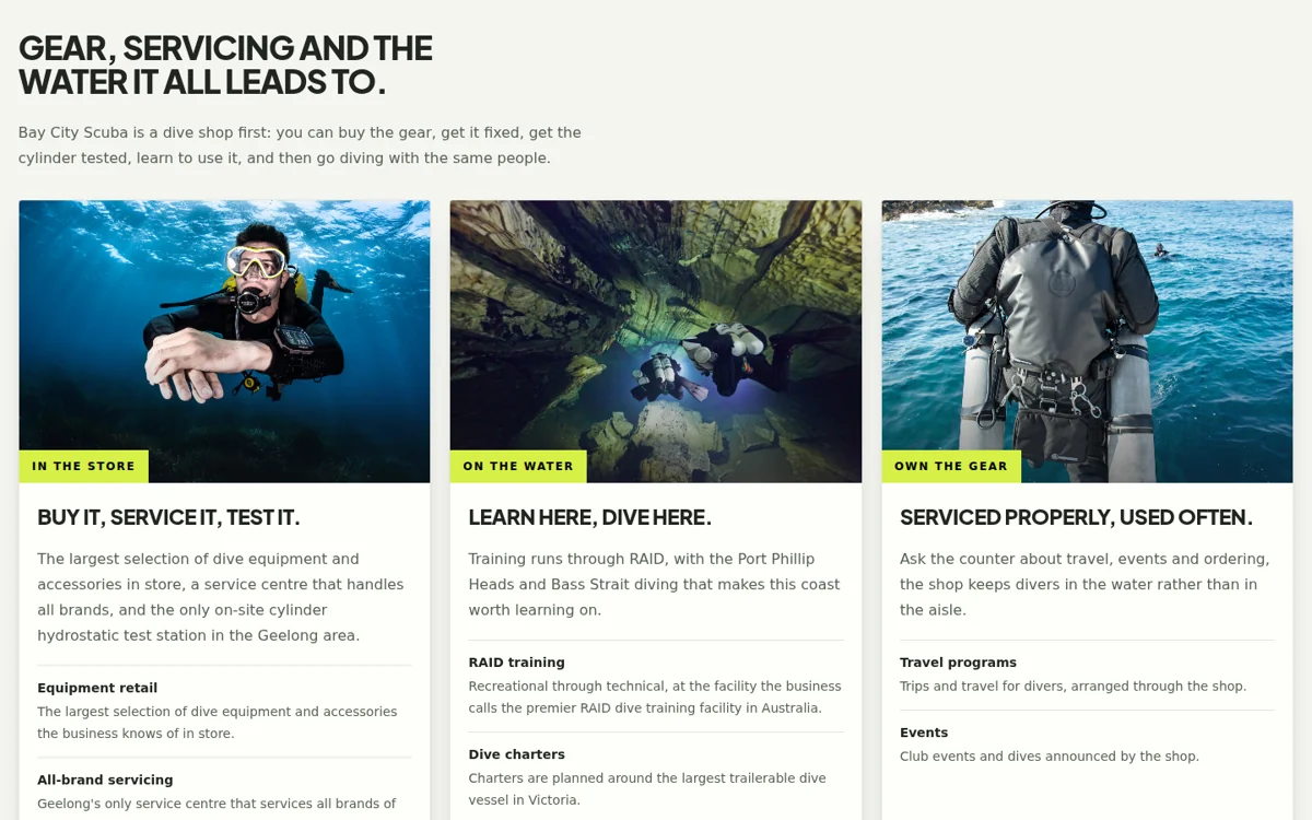 A dive centre in Geelong content and interface detail
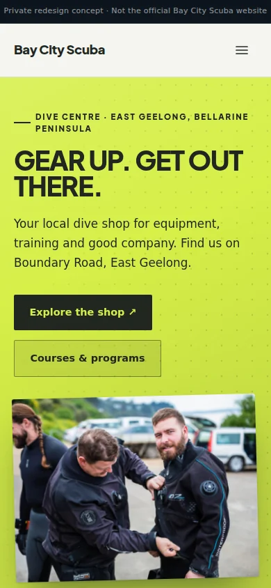 Designed for a smaller screen, too.Next projectWhale watching in Albany↗︎