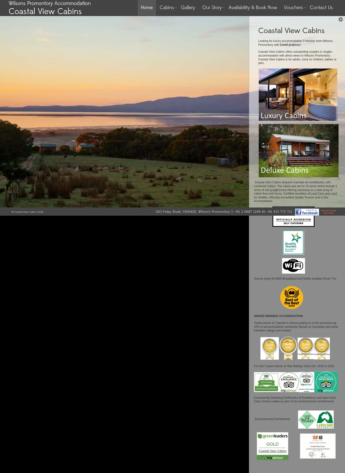
Hover to preview · Drag or scroll inside either frame. Use arrow keys when focused.
BeforeTheir designWebsite captureAfterOur redesignExplore the complete design Their design beside our redesign. Our redesign has not been deployed. Design captures from 2026-09-27.
What the transformation changes
A clearer reason to choose.
A simpler way to enquire.
01
Show the accommodation, not just the view.
Their design. A large landscape photograph dominates while much of the cabin information is squeezed into a narrow column.
Our redesign. Two cabin-style cards bring room imagery and details into the main reading path, followed by the setting and facilities.
Guests can connect the scenery with the accommodation they would actually book.
02
Turn useful details into reassurance.
Their design. Facilities, restrictions and awards are mixed into compact text and badges.
Our redesign. Amenities, owner information, credentials and practical questions each have a clear place before the date-checking prompt.
The offer is easier to assess without searching through a dense sidebar.
This is a design and content assessment of the two versions, not a claim of measured increases in enquiries, search rankings or loading speed.
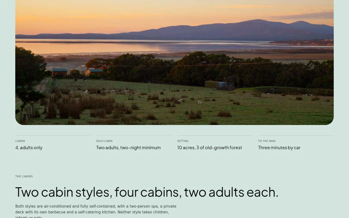 Private cabins near Wilsons Prom content and interface detail
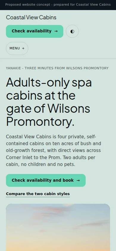 Designed for a smaller screen, too.Next projectGuided cycling & walking holidays↗︎